Questionable Project
Print and Web Design, 2 x 8 ft Poster and Website
This project questions the validity of scientific research. It examines the important details that are often hidden from the reader. For example, funding bias occurs when a study is paid for by a company that may benefit from certain results.
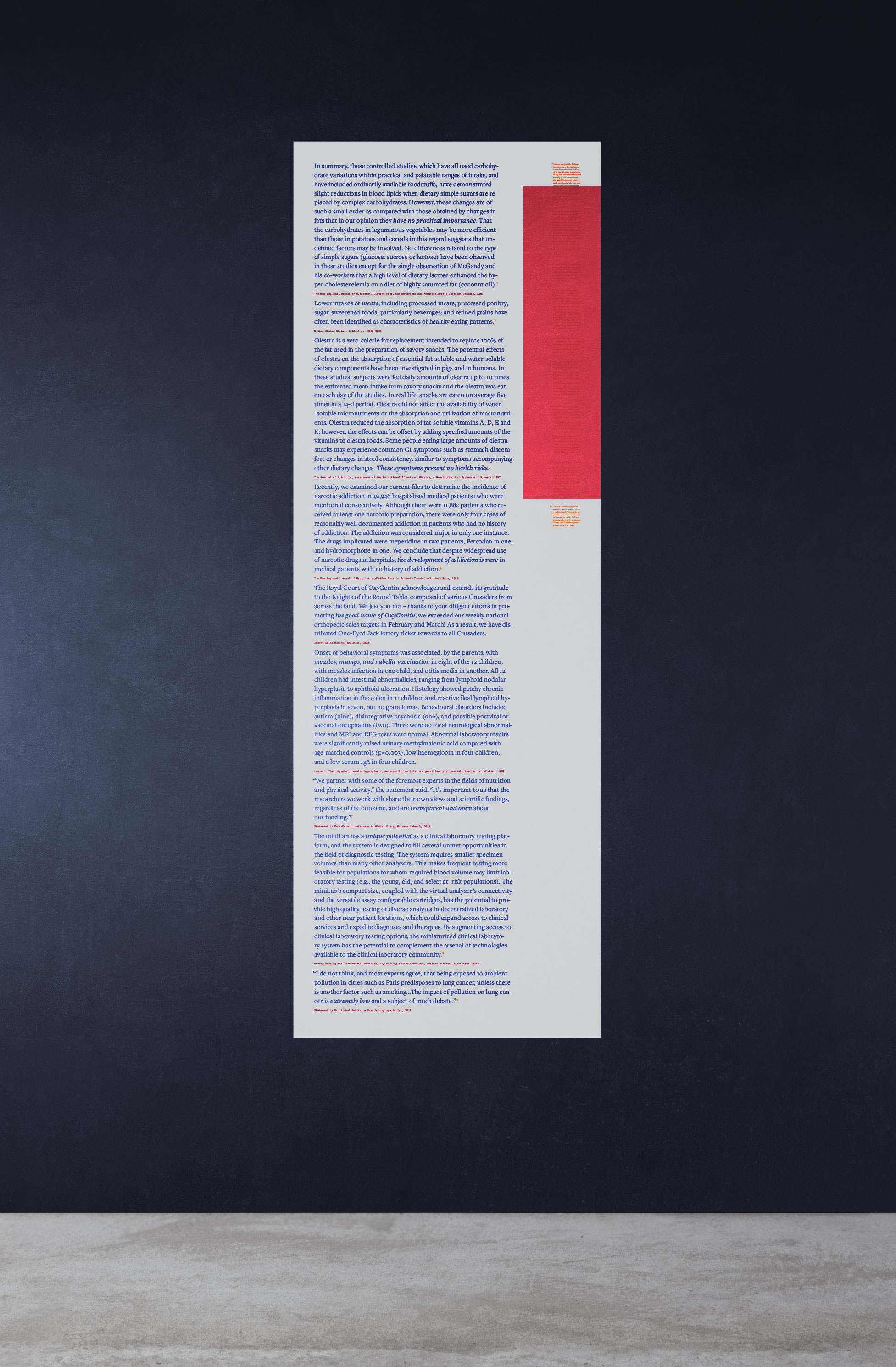
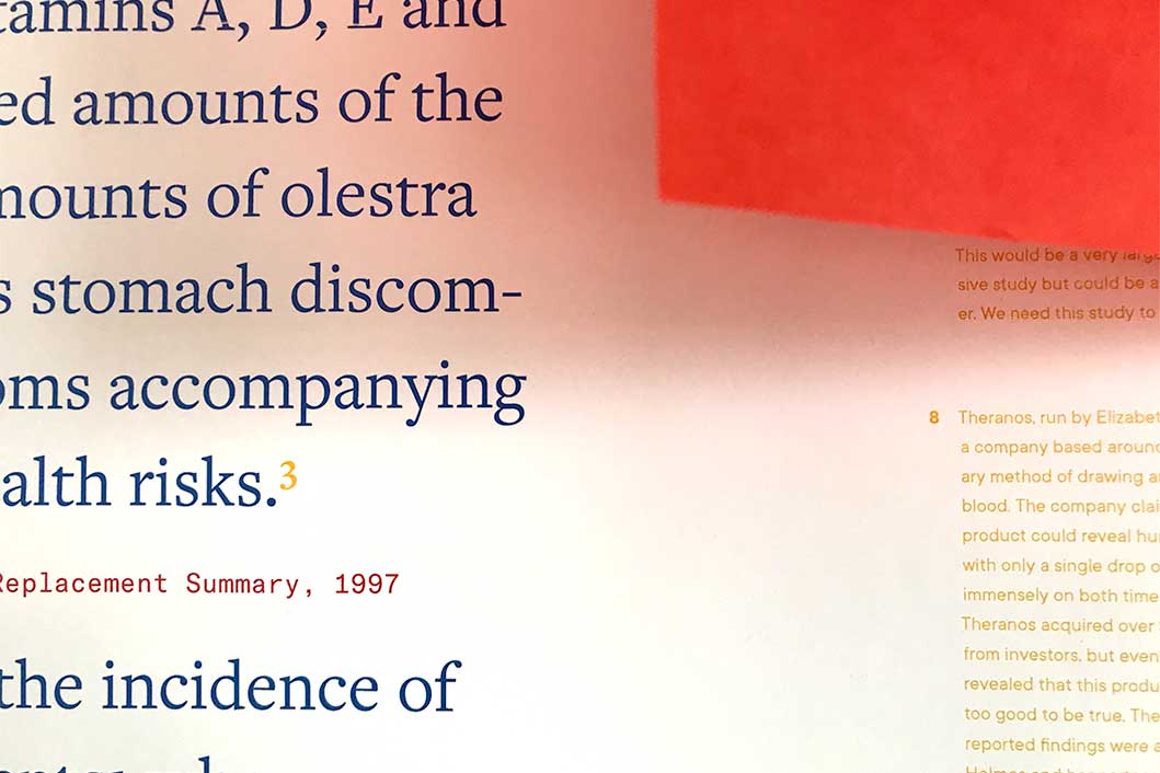
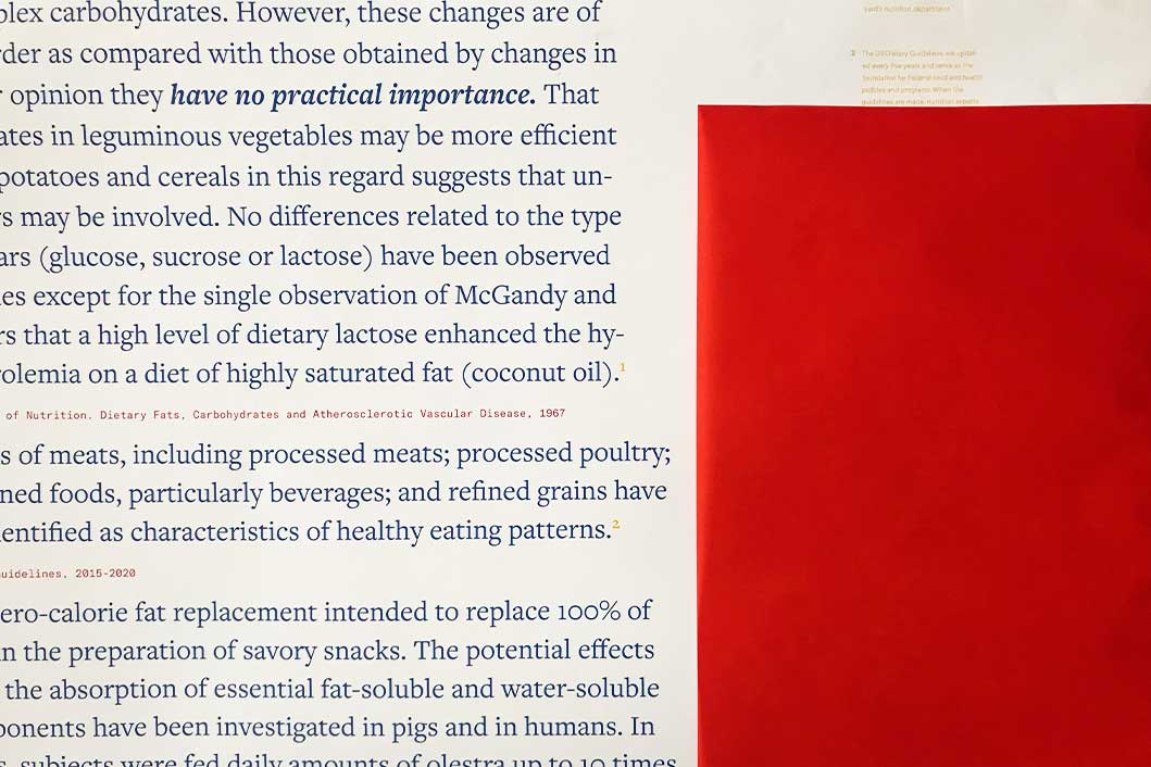
Part 01: The Poster
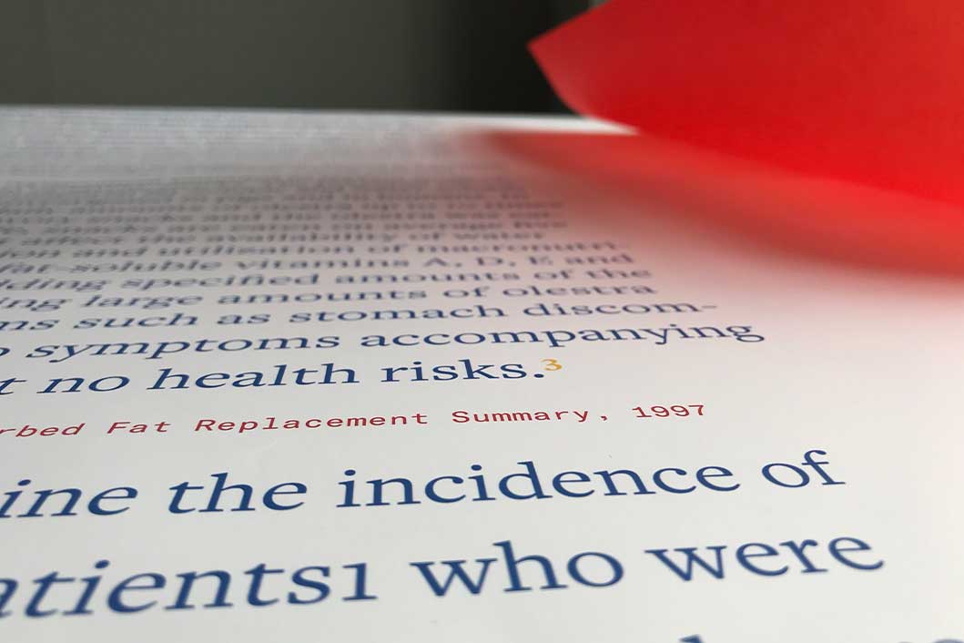
I used portions of articles that were found to be untruthful in some way. The text of the articles is presented in large, bold type, clearly visible to the viewer. The truth is veiled by a translucent red sheet and written in a faint, yellow color. The viewer is forced to work harder to find the truth.
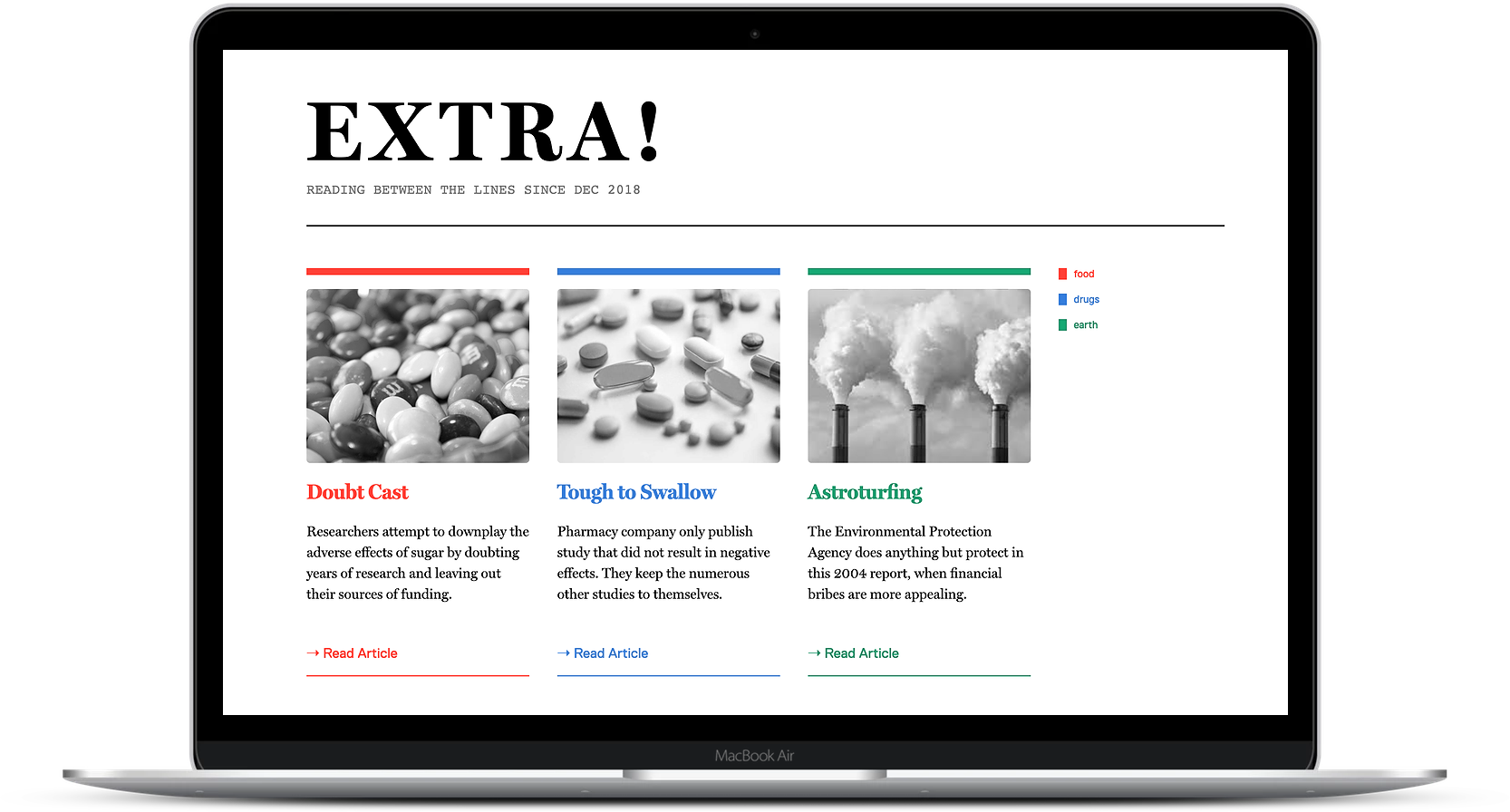
Part 02: The Website
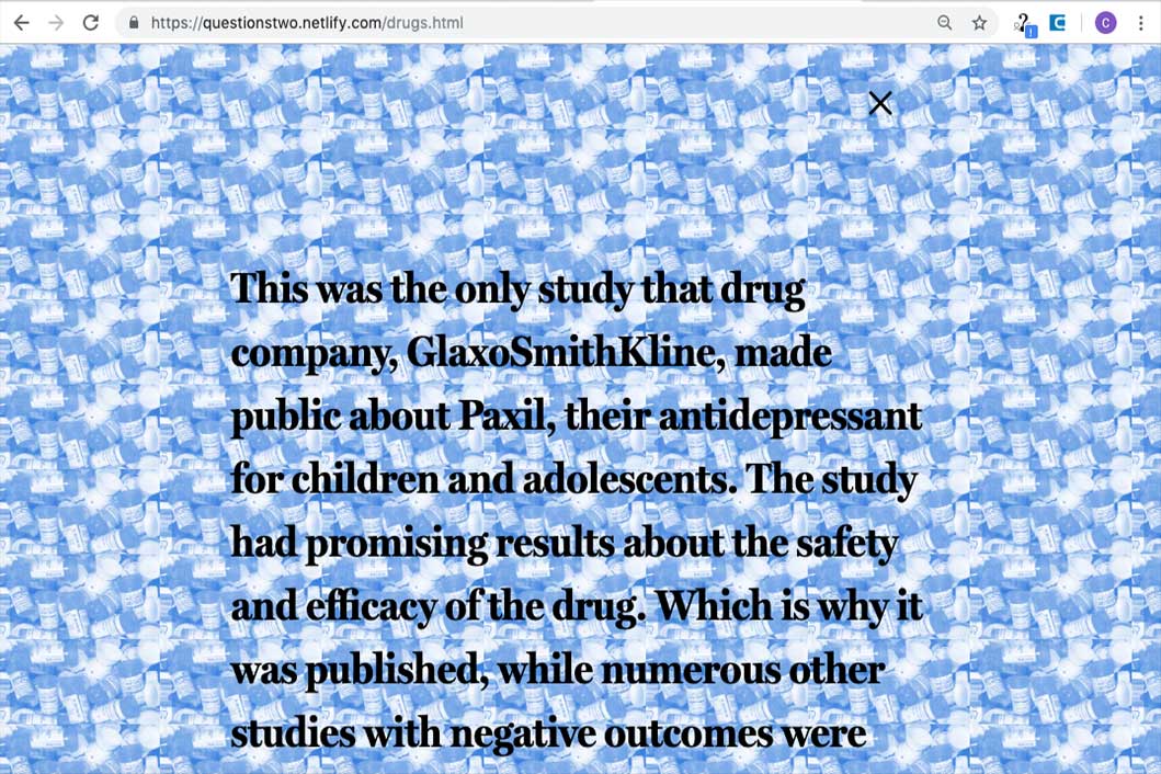
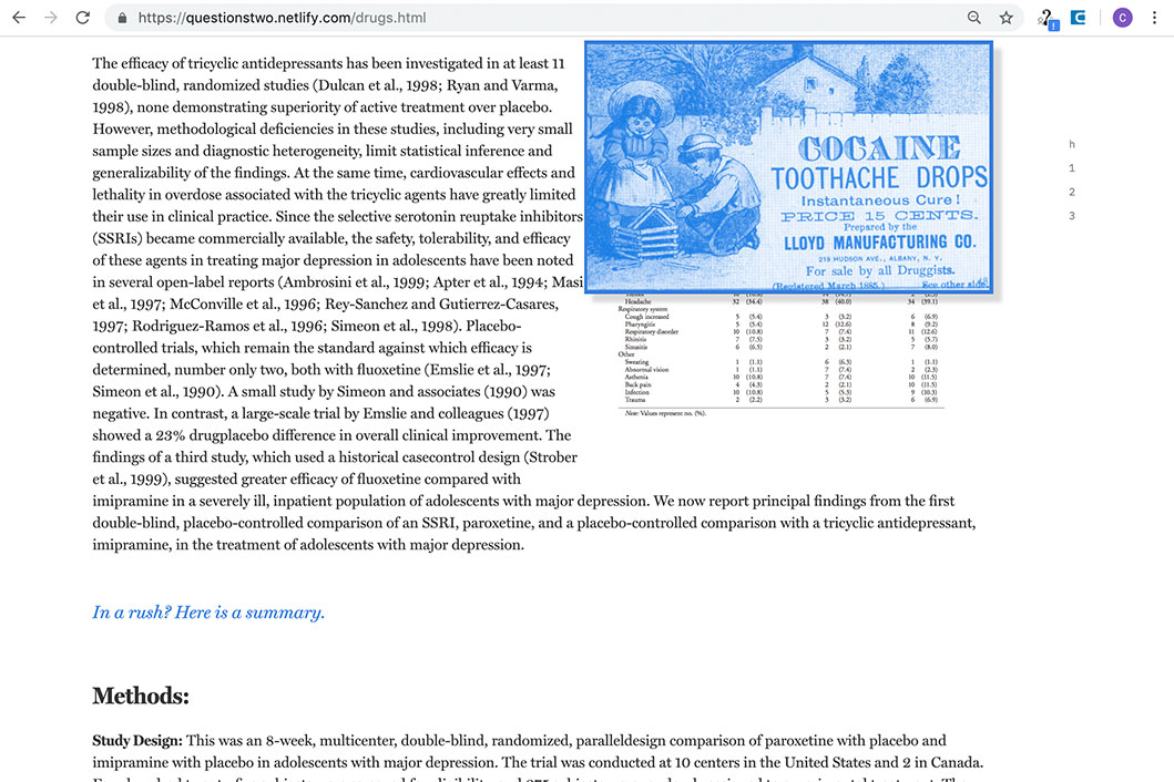
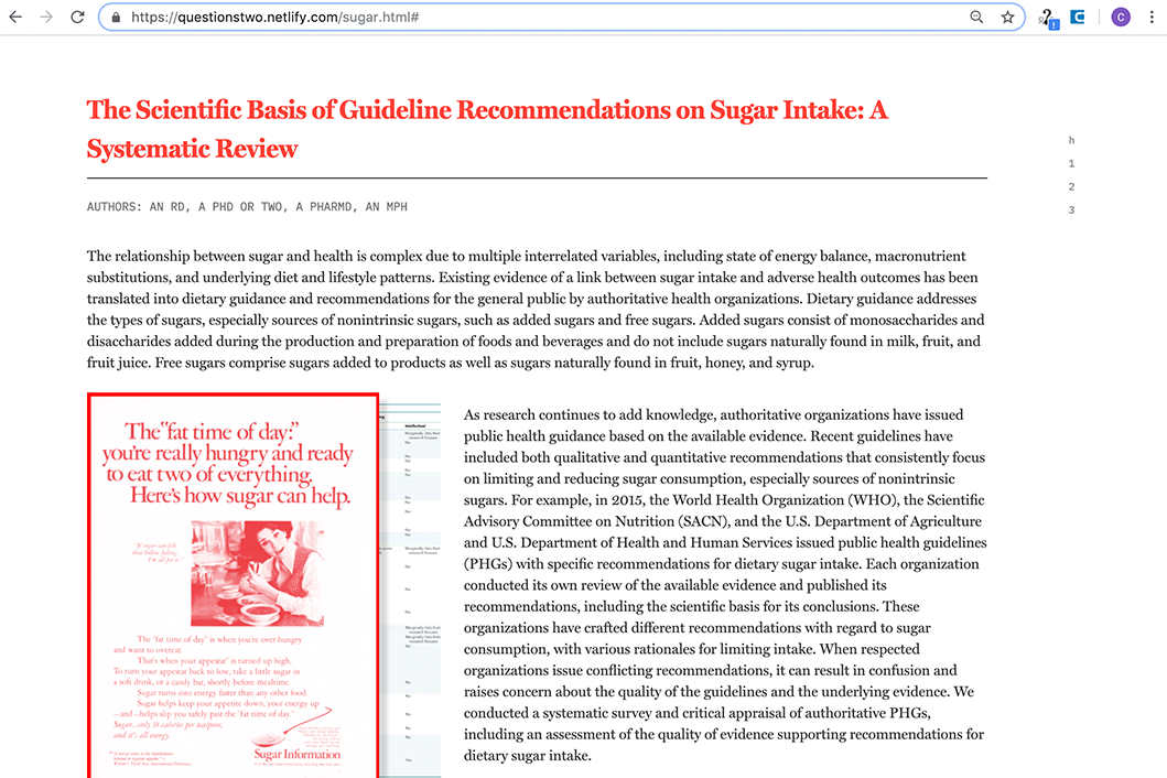
We were tasked with transforming the original content into a new form. I chose to create a website. Laid out like an online publishing platform, each article is presented to look like a standard research paper. However, as the viewer scrolls and hovers over certain areas on the screen, portions of the truth begin to emerge. An image emerges, a sound effect plays, or information is revealed, in an effort to shock the viewer.
